

War (dislike) I decided to remove the army hat from the bear as I felt that this seemed to be a bit too strong and avert the focus from the actual picture. The crutches add a new dynamic to the image, which makes me wonder who the crutches actually belong to? What happened? The war seems to be a playground war, similar to the fights and arguments that happen during childhood.

Music (like) I got rid of the text that said 'Together We Can Make Sweet Music', it struck me as a little too cheesy. Two people holding hands symbolises the communion that music has the power to produce. Two people holding hands sounds like it would be a sweet and beautiful image - but the drawing shows a reluctant hand (fist clenched) and a 'female' hand that is missing a finger with nails that look like claws. The image conjures up lots of question and is open to interpretation , but the 'ugliness' of the scene holds a certain beauty that is just strange.

Consumerism (dislike) My idea was to have a boy pressed up against the glass of a shop, looking inwards. The 'stars' are actually stickers like the ones used to promote and advertise offers and sales. The boy looks totally absorbed in whatever he is looking at, but he could well be looking at us - the audience. The way I have illustrated the child reminds me of a puppet. As a viewer I'm intrigued to know what is on the other side of the window.

News (dislike) The news at present seems dominated with relationships, i.e. the Tiger Woods scandal, William and Kate's wedding, affair after affair etc. But what about relationships closer to home? After all they are news too. My idea was to focus on a paperboy, a woman and an anchorman. The anchorman brings the news to the woman and she loves him for it, but it's the paperboy who really loves the woman. I like how many meanings and scenarios can be derived from this one image. The minimal colour helps to absorb and capture the viewer's attention and place them on the outside looking in, with the lovesick paperboy.

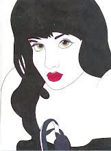
Books (like) At first glance the girl looks to be counting, but after reading the text it becomes evident that she is reading. To me the act of reading is like praying on opened palms - moments of peace, calm and quiet to concentrate on words full of beauty. The text tells you one thing, but leads you away by suggesting another. The use of only three colours doesn't distract or overpower the audience. The image is simple and complicated at the same time.

Spiders (dislike) Everybody knows who Spiderman is, unless you've been cut off from the rest of the world for the past 50 years. I have used the idea of Spiderman and applied it to a man actually covered in spiders. The way I have drawn the man allows it to be interpreted as a man or a child. The very idea of somebody covered in spiders is my idea of hell. The style of the illustration is obscure, for instance - the spiders look like stars. So if the text was covered it would look as if the person was covered with stars.

Bedtime (like) Bedtime is a time to rest, dream and recuperate. Sleep is important, we need it in order to cope with everyday tasks - if we do not sleep, we cannot function properly. Sleeping positions are very revealing, they differ from person to person. I pondered the idea of a baby in the womb to mean bedtime. The fetal position is a very common sleeping position - perhaps in sleep we feel as we did inside the womb? The void in which the baby rests is peaceful, the black seems to sum up the vastness of the womb.

Mini Cheddars (dislike) Edward Gorey's style and approach has inspired me greatly, his works have mass appeal - they mix storytelling, beautiful visuals and dark humour in order to form unique and exquisite little masterpieces. Discovering Gorey's wonderful and bizarre world helped me to open up to the possibilities of introducing the strange and surreal to my work. This drawing/story/scene popped into my head and made me chuckle, as it is both absurd and unusual. The way I have approached illustrating the sentence is reminiscent of Gorey's sometimes unconventional pictures.

Maths (dislike) Numbers have numerous ways of being displayed, roman numerals, binary, numeric, written etc. I have opted for a tally as the display reminds me of the long, laborious and strenuous process of a countdown. The tally is repetitive, thus the image repeats endlessly.

Myself (like) White space can mean any number of things - freedom, loss, loneliness, a sense of not belonging or space to breath. I have used it so that the text is in the center (the statement is open to debate). I really lack self-confidence and over compensate by perhaps coming across as big-headed and sometimes arrogant.


No comments:
Post a Comment